Flowery Branch Antique Market is the first full weekend of each month and now that I have a large booth there I spend a great deal of time refurbing, repurposing, and cosmetically reworking furniture and accessories. I absolutely LOVE making junk into useful and beautiful treasures!! The down side I've found is that it feeds my furniture addiction, but that might not be such a bad thing. :-)
Here are some of the latest "creations" of mine, more Before & Afters:
These end tables had plenty of potential and had obviously had a rough life. I think someone didn't have any coasters...
Lots of sanding, good primer, and fresh paint made a world of difference. And I just noticed that I took a picture before the hardware was all installed. hmmmm...
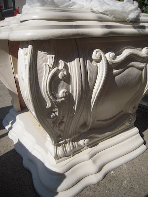
I'm particularly excited about the result of work on some baroque style bedroom furniture. It was a COMPLETE disaster when I got it. I've had to do a lot of work on furniture before, but I've NEVER.SEEN.ANYTHING.LIKE.THESE.PIECES. NONE of the drawers worked properly and one drawer was missing all its pieces but the front. It looked as though the top of this furniture had been used for wet drinks, ashtrays, and possibly deep frying (guessing on that from the amount of grease that was caked on and under the drawers). This certainly seemed like a Humpty Dumpty case to me and there were times when I wondered if I really COULD put all the pieces back together again, OR if I should even bother.
See that BLOB of goo toward the right front of the bottom drawer area, and the BLOB about halfway back closer to the middle of the same drawer area? That was TAR. Or some substance with qualities very similar to tar.
Here is an in-progress closeup of one of the drawers. You can see how much TSP I had to use along with my wire brush. I actually used my garden hose INSIDE the drawer casements along the back, sides, and dust covers, and scrapers & screwdrivers to remove some sort of tar-like goo that was in clumps inside. EWW.
The sea of drawers that have been cleaned, awaiting the next step. A key piece of this gigantic furniture puzzle was LABELING each of the pieces as I removed them, INCLUDING the hardware. Because each drawer front was shaped, it really did matter where they went back in and how. I used a sharpie marker and labeled in the under side of each drawer as I went along, repairing both the tracks and reassembling the drawers themselves with wood glue.
Already it looks much better, having been repaired, sanded, primed, sanded again, and painted. I only used one coat of paint since I planned to glaze.
Here you can REALLY see the difference glaze makes! I used Martha Stewart's "Black Coffee" metallic glaze over "Cinnamon Cake" color Sherwin Williams satin finish paint. "Cinnamon Cake" is a Behr color but they can formula match it at SW and it is my go-to cream color- I LOVE the undertones of this paint; it's the perfect cream and even works alongside Heirloom White spray paint. The glaze doesn't look as starkly BLACK in person as it does in the above picture; it's really closer to the color in the picture below. "Black Coffee" is the perfect name for this glaze and it is GORGEOUS; having an indefinable "is it black or is it dark brown?" look, and in the sunlight the SLIGHT metallic shimmer is stunning.
One piece down, a gazillion more to go... this is one project that threatened to overwhelm me, but I just took my time and did one painfully slow step at a time. Daubing the glaze on with my paintbrush and using cheesecloth to wipe most of it off, around and in all those crevices took FOREVAH but the effect is definitely worth it.
I didn't get a picture of the mirrors before I removed the backing and glass. Here they are about to be assaulted with TSP and a wire brush. :-)
Mirror frame on the left has been coated with automotive primer (spray), and the one on the right has one coat of paint on it. Same process was used on the mirrors as the other pieces- cleaning, priming, painting, glaze, and cheesecloth. I was unsure how the glaze would work with spray paint, since the glaze is water-base and spray paint is of course oil based. It worked really well; although I wouldn't do that on a horizontal surface that might see some wear & tear, on a mirror frame it was perfect.
All dressed up and ready to go home with someone...
detail view- top of one mirror
detail view- corner of one mirror
The finished chest. It is 63" tall, 35" wide, and 21" deep. That's large. I had to stand on a ladder to sand, prime, paint, and glaze the top because it's exactly the same height as I. :-)
Detail view of chest, drawers slightly open to show the English dovetail construction.
I painted all the brass hardware "dark bronze" after cleaning and priming each piece.
OH the difference working on something 4 hrs a day/5 days a week for 2-3 weeks can make!
Here's a side-by-side comparison of before & after of the nightstand:
These pieces are not my personal "style," but I have to admit that I did think about keeping the nightstands and mirrors. They would be SOO lovely with the mirrors hung each over a mirror, flanking a bed. Very dramatic.
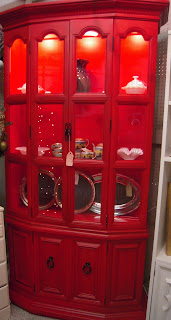
I made cosmetic-only changes to a china cabinet using some UBER BRIGHT red paint (fire engine RED, baby!), called "Sweet Tomato" and the leftover glaze from the baroque furniture project:
SNORE! to say the least, but...
Sweet Tomato spray paint applied...
glaze applied, and...
That china cabinet is STACKED!
SNORE NO MORE!!


